Tutorials
|
Using Scientific Data
- Prism image by Suidroot - CC BY-SA 4.0
October 18, 2018
The Pixar Surface material has great physical shading properties which can be sometimes confusing to understand, so let's try to demystify these properties in an easy way.
First, let's switch our specular values to Physical instead of Artistic. The attributes we need to concern ourselves with are Refractive Index (bending of light) and Extinction Coefficient (distribution of light across the surface).
Now we can use a site such as refractiveindex.info in order to find the relevant data for our specular. Lets use Gold as an example.
If you look at the first section, "Optical constants of METALS", the values we need are right there in big bold font. Great, so let's go back into Maya and put those in.
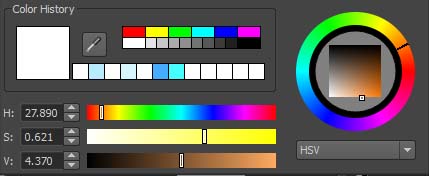
There is not one but three places where our values could be entered. Maya's default color picker uses Hue, Saturation, Value (HSV). The first key step in using these attributes correctly is to switch the color picker from HSV to RGB (0.0 to 1.0). The reason we want to use RGB is because this attribute is essentially controlling how the Red, Green, and Blue light interacts with the material, so what we really want to know is the refractive index or extinction coefficient values of Red, Green, and Blue light separately for Gold.

Being a scientific site, refractiveindex.info doesn't allow you to directly ask for "Red" light, but you can enter a specific wavelength. Online, we can search for the Visible Spectrum of light and conclude that the wavelengths for R,G,B are:
Because refactiveindex.info uses µm, we need to convert it to 0.620-0.750 µm. If you do this for Red, Green, and Blue and pick a value within that range, you will get something like 0.65, 0.55, 0.45 for their respective colors.

Back at refractiveindex.info, at the top of the "Optical constants of METALS" section you can enter these wavelengths. The values you get back are the values you should enter into the color picker. If we do this for Gold we get this:

While it's mathematically accurate, it's a bit pale for my taste so here I tweaked the Extinction Coefficient, increased the Red and dropped the Green and Blue to give a warmer color...this isn't unheard of as higher carat gold tends to be warmer.

You'll have to ask yourself whether you care more about the underlying values being accurate or the resulting image being more appealing.
Original tutorial written by S. Young and updated by Leif Pedersen.
Prism image by Suidroot [GFDL (http://www.gnu.org/copyleft/fdl.html) or CC BY-SA 4.0 (https://creativecommons.org/licenses/by-sa/4.0), from Wikimedia Commons